
Home>How-To Guides>Tips and Tricks>Netflix Subtitles: Adjusting Your Settings
Tips and Tricks
Netflix Subtitles: Adjusting Your Settings
Modified: September 5, 2024
Learn valuable tips and tricks for adjusting Netflix subtitles to enhance your viewing experience. Discover how to customize settings for an optimal streaming experience.
(Many of the links in this article redirect to a specific reviewed product. Your purchase of these products through affiliate links helps to generate commission for Techsplurge.com, at no extra cost. Learn more)
Table of Contents
Introduction
Netflix has become a staple in modern entertainment, offering a vast library of movies and TV shows that cater to diverse tastes and preferences. One of the key features enhancing the viewing experience is the availability of subtitles and closed captions. These tools are crucial for accessibility, helping viewers who are deaf or hard of hearing, as well as those who prefer to watch with subtitles for better comprehension. However, adjusting the subtitle settings can sometimes be tricky. Understanding how to do it effectively is essential for an optimal viewing experience. This article will guide you through the process of adjusting your Netflix subtitle settings, including tips on improving readability and adhering to Netflix's guidelines for subtitle creation.
Understanding Netflix Subtitle Settings
Before diving into the adjustments, it's important to understand the basic settings available for subtitles on Netflix. The platform offers a range of options that can be customized to suit individual preferences. Here are the key settings you can adjust:
Text Color
The default text color for subtitles on Netflix is white, which can sometimes be difficult to read, especially in scenes with dark backgrounds. Changing the text color to yellow can significantly improve readability due to higher contrast with black outlines and background colors.
Drop Shadow
Adding a drop shadow to the subtitles can enhance their visibility by creating an offset black border around the text. This feature is particularly useful for improving readability, especially in scenes with complex backgrounds.
Font Size
The font size of subtitles can be adjusted to better fit the screen. Larger fonts may be more readable but could also clutter the screen, while smaller fonts might be less obtrusive but harder to read.
Font Style
While Netflix doesn't offer a wide range of font styles, Arial is used as a generic placeholder for proportional Sans Serif fonts. This style is designed to be clear and readable without being too ornate.
Positioning
Subtitles can be positioned at either the top or bottom of the screen. For most content, center justification is preferred to avoid overlap with on-screen text. However, for Japanese content, vertical positioning is allowed.
Adjusting Subtitle Settings on Netflix
To adjust your subtitle settings on Netflix, follow these steps:
Accessing Account Settings
- Hover over your account avatar located at the top right corner of the screen.
- Click on "Account Settings" from the dropdown menu.
Navigating to Subtitle Appearance
- Scroll down to the "Your Profile" section.
- Click on "Subtitle appearance."
Customizing Subtitle Appearance
- Change the text color to yellow for higher contrast.
- Select "drop_shadow" from the dropdown list to add an offset black border.
- Adjust the font size as needed.
- Save your changes.
Adjusting Subtitle Size and Style
- Open the Netflix app on your device.
- Begin playing a TV show or movie.
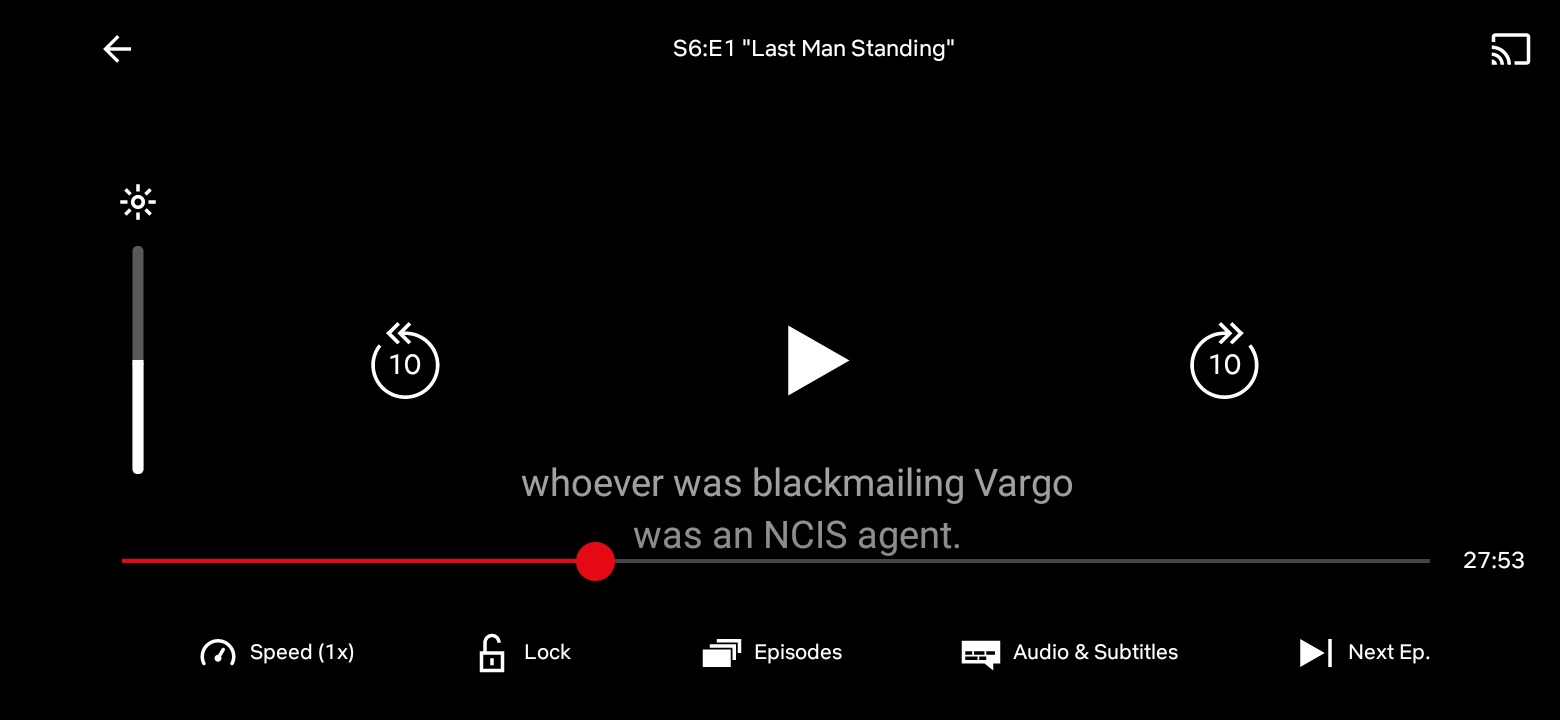
- From the player controls at the bottom of the screen, select "Settings."
- Choose your size and style preferences for subtitles.
- Resume playing the title.
Managing Profiles
- From the lower right corner, tap "My Netflix."
- From the upper right corner, tap "More."
- Tap "Manage Profiles."
- Select the profile you want to edit.
- Tap "Subtitle Appearance."
- Choose your subtitle appearance settings. The new settings will automatically save.
Tips for Improving Readability
While Netflix provides a range of settings to customize subtitles, there are additional tips that can enhance readability:
Contrast
Using yellow text with a black outline and background can significantly improve contrast and make subtitles easier to read.
Drop Shadow
Adding a drop shadow can help the text stand out from the background, making it more readable, especially in scenes with complex backgrounds.
Font Size
Adjusting the font size to fit the screen without cluttering it is crucial. Larger fonts may be more readable but could also be distracting, while smaller fonts might be less obtrusive but harder to read.
Background Color
If possible, choose a background color that contrasts well with the text color. For example, white text on a dark background can be difficult to read, so changing the background color or using a drop shadow can help.
Adhering to Netflix’s Guidelines for Subtitle Creation
Netflix has strict guidelines for creating subtitles to ensure consistency and quality across all content. Here are some key guidelines:
Accuracy of Content
- Include as much of the original content as possible.
- Do not simplify or water down the original dialogue.
- For dubbed content, refer to the dubbing script or dubbed audio as the basis for the SDH file and ensure that the two match as much as reading speed and timings allow.
Character Limitation
- Each line should not exceed 42 characters.
- Truncating the original dialogue should be limited to instances where reading speed and synchronicity to the audio are an issue.
Line Treatment
- Text should usually be kept to one line unless it exceeds the character limitation.
- Line breaks should be made after punctuation marks, before conjunctions, and before prepositions.
Positioning
- All subtitles should be center justified and placed at either the top or bottom of the screen, except for Japanese content which allows vertical positioning.
Consistency
- Use KNP (Knowledge-based NLP) tables to ensure consistency across episodes and seasons.
- Discuss with your Netflix contact the most suitable KNP workflow for your project.
Technical Aspects
- Use TTML files that adhere to specific technical specifications.
- Only use percentage values for font size and other measurements, avoiding pixel values.
- Ensure that all TTML files created for subtitles or SDH follow the approved guidelines.
Common Issues with Netflix Subtitles
Despite the customization options available, some users may encounter issues with Netflix subtitles. Here are some common problems and potential solutions:
Subtitles Being Too Large
- If subtitles become too large, it may be due to settings on both the Netflix app and your device being set to increase the size of subtitles.
- To resolve this, change the subtitle settings on either your Netflix account or on your device.
Subtitles Being Difficult to Read
- If subtitles are difficult to read, try changing the text color to yellow or adding a drop shadow.
- Adjusting the font size and ensuring good contrast between the text and background can also help.
Lines of Dialogue Being Skipped or Omitted
- This issue might be device-specific, but it could also be related to the complexity of the dialogue.
- Checking the device settings for subtitle accessibility and ensuring that the subtitles are not being overridden by other audio settings can help resolve this issue.
Adjusting your Netflix subtitle settings can significantly enhance your viewing experience. By understanding the available settings and adhering to Netflix’s guidelines for subtitle creation, you can ensure that your subtitles are clear, readable, and consistent. Whether you prefer yellow text with a drop shadow or the default white text with a black outline, customizing your subtitle settings is a simple process that can make a big difference in how you enjoy your favorite shows and movies.